Rogotanic: A Modern Display Font That Elevates Digital Branding
There I was—midway through refining the hero section of a boutique coaching site—when I paused, scrolled back up, and swapped out the safe sans serif headline for Rogotanic. Instantly, the page breathed differently. Not louder, exactly—but more intentional, more human, more *designed*. That’s the quiet power of a well-chosen display font: it doesn’t shout; it invites attention with confidence and clarity.
What Rogotanic Brings to the Screen
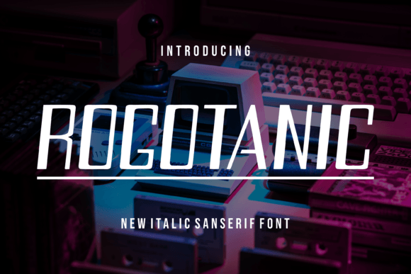
Rogotanic is a clean, contemporary display font with subtle geometric warmth and confident letterforms. It’s not overly ornate, but it’s never generic—it has presence without pretension. The lowercase ‘a’ and ‘g’ carry gentle personality, the uppercase letters sit with balanced weight, and spacing feels intuitively generous. On screen, it renders crisply across modern browsers and devices, with no hint of blurriness or inconsistent hinting—even at 48px on a high-DPI monitor or scaled down to 36px on tablet view.
As a web designer, I test fonts in context—not just as isolated specimens, but where they’ll live: over image banners, beside form fields, nested in responsive cards, and stacked in mobile navigation toggles. With Rogotanic, I found it thrives in moments that need emphasis and emotional resonance: hero headlines, section dividers, CTA buttons (when sized appropriately), and branded quote blocks. Its rhythm supports scanning, not slowing it down.
Real Layout Testing: Where It Shines—and Where to Pause
I dropped Rogotanic into five distinct web contexts: a product landing page header, a portfolio project title, a blog post intro line, a course sales page subhead, and a digital brand kit preview card. In every case, it added polish without sacrificing usability.
- Hero sections: Paired with a neutral sans serif like Inter or Manrope for body copy, Rogotanic created instant visual hierarchy—readers landed on the message first, then naturally flowed downward.
- Landing page CTAs: At 24–28px on buttons, it felt bold but legible—even with subtle hover animations. Just avoid using it below 20px for interactive elements; its character details soften at smaller sizes.
- Image overlays: Over muted photography or soft gradients, Rogotanic held its own without needing heavy text shadows—its contrast and x-height made it pop cleanly.
- Mobile previews: At 32px on iOS Safari and Chrome Android, it remained highly readable. No letter collisions, no awkward kerning breaks—just consistent, friendly authority.
That said, I didn’t force it where it didn’t belong. Rogotanic isn’t built for long paragraphs, navigation menus, form labels, or data-dense dashboards. Its charm lies in intentionality—not utility. Using it for body copy would undermine both readability and brand cohesion. Think of it as your brand’s voice during key moments—not its everyday speaking tone.
Pairing It Thoughtfully (No Guesswork Needed)
Display fonts earn their keep through smart pairing—and Rogotanic pairs beautifully with purpose-driven companions. I tested several combinations, and two stood out consistently:
- A warm, highly legible sans serif (like Poppins, Lato, or the variable font Inter) for all UI text, body copy, and captions. This creates balance: Rogotanic brings character; the sans brings clarity.
- A refined, low-contrast serif (such as Cormorant Garamond or Playfair Display) for editorial-style sites—think blogs, storytelling landing pages, or premium service offerings. Here, Rogotanic works best as the top-tier headline, while the serif handles subheads and longer-form content with grace.
What didn’t work? Pairing it with another decorative display font (too much visual competition) or a tight, condensed sans (creates tension without payoff). Keep it simple: one expressive voice, one supportive voice.
Technical Fit for Real Projects
Before dropping Rogotanic into a live site—or a client handoff—I checked three practical things: file formats, weights, and licensing. The version I used included WOFF2 and WOFF files (ideal for web performance), a single robust weight (ideal for focused impact), and clear commercial licensing for client projects and SaaS interfaces. No hidden restrictions, no surprise fees for e-commerce use or newsletter headers.
I also verified multilingual support—basic Latin-1 coverage is solid, including accented characters common in English, Spanish, French, and German. If you’re building for broader European or global audiences, double-check extended language support in your license, especially for diacritics or ligatures.
One note for developers: Rogotanic loads quickly, but always declare font-display: swap in your @font-face rule. This ensures text remains visible during load—no invisible headlines or layout shifts.
When to Reach for Rogotanic—And When to Reach Past It
Reach for Rogotanic when you want to:
- Anchor a brand moment—like a “Welcome” headline on a homepage or a “New Collection” banner;
- Add warmth and distinction to a minimalist portfolio or creative studio site;
- Elevate a course or coaching offer without resorting to clichéd script fonts;
- Create visual consistency across a suite of digital assets (landing pages, email headers, social banners);
- Signal thoughtful design—subtly telling users, “This was made with care.”
Step past it when you need:
- High-density information delivery (dashboards, pricing tables, documentation);
- Small interface text (under 16px) or accessibility-critical labels;
- A font with multiple optical sizes or variable axes for fine-tuned control;
- Extensive language coverage beyond Western European scripts.
Rogotanic isn’t trying to do everything. It’s designed to do one thing exceptionally well: give digital spaces a memorable, modern, and human-centered voice—one headline at a time.